Appearance
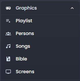
Graphics & Overlays
Playout gives you real-time control over the graphics that appear on your live broadcast. Once you open an event, the Graphics section appears in the sidebar.
Playlist (Queue)
The playlist is your main staging area for items you want to send to the screen. Think of it as a "next up" list.
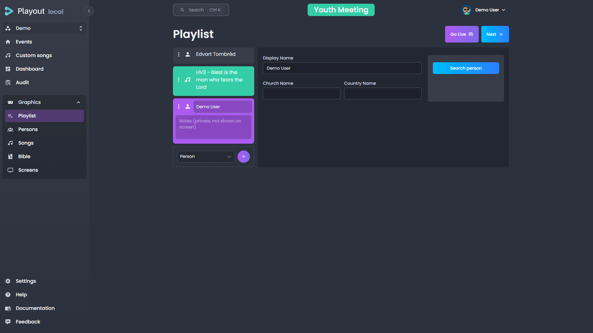
Adding Items
Add items to the playlist from the Persons, Songs, or Bible tabs. When you find something you want to queue, click the add to playlist action on that item. It will appear in the playlist panel.
Reordering
Drag and drop items in the playlist to change their order.
Sending to Screen
Click on a playlist item to send it to the live screen. The item will be displayed as a lower third or fullscreen overlay depending on its type.
Removing Items
Remove items from the playlist by clicking the remove action on the item.
Saving a Song to Custom Songs
When a song is in the playlist and is not live, a Save as custom song button appears below the song editor. Click it to save a copy of the song to your tenant's custom songs library. A success notification confirms the action.
TIP
This is useful for keeping a local copy of a shared song that you've customized with comments or structural changes.
Persons (Lower Thirds)
The Persons tab lets you search for people and display their name as a lower-third overlay on the broadcast.
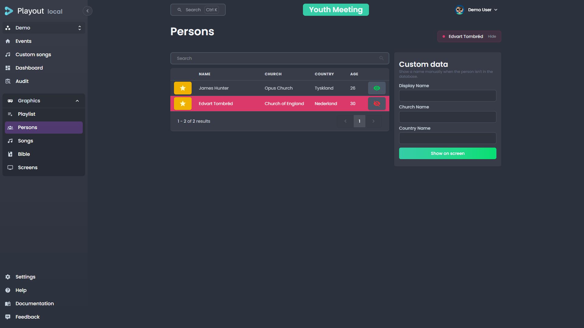
Searching for a Person
Use the search bar at the top to find a person by name, church, country, or person ID. Results appear instantly as you type and load progressively as you scroll down.
Displaying a Lower Third
Click on a person in the search results to send their name to the screen as a lower third. The overlay will appear using the duration configured in your tenant settings.
Person Details
Each search result shows:
- Display name
- Title (optional)
- Church
- Country
Lower Third Layout
When a person is sent to screen, the lower third displays:
- Header — the person's display name
- Body — the person's title (if set), followed by church and country separated by a dot (e.g. "Oslo · Norway")
Church & Country Visibility
By default, both church and country are shown on person lower thirds. You can control this globally in Settings → Lowerthird using the Show church and Show country toggles.
You can also override visibility per person before sending. In the person search table and in the playlist person editor, checkboxes next to the church and country fields let you toggle their visibility for that specific lower third.
TIP
If your tenant has sharing links set up, you can also search people from shared tenants.
Songs
The Songs tab provides full control over song lyrics during a broadcast.
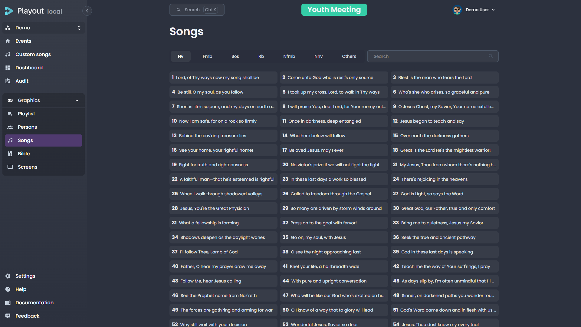
Selecting a Song
Search for a song by title, number, or author. Click a song to open its verse navigator.
Navigating Verses
Once a song is selected, its structure (verses, choruses, bridges) is displayed. Click on any section to send it to the screen.
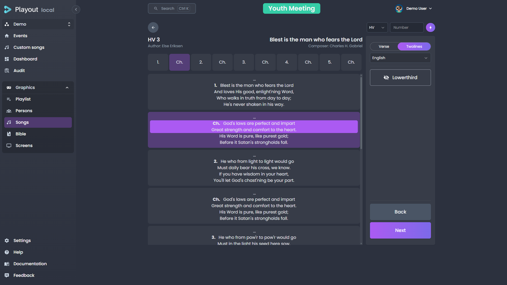
Display Modes
The display mode controls what happens when you press the next action, and is configured in your tenant settings:
| Mode | "Next" behavior |
|---|---|
| Verse | Advances to the next verse (or chorus, bridge, etc.) in the song structure |
| Two-line | Advances to the next group of lines within the current verse |
Lines per Group
When using Two-line mode, you can configure how many lines are shown at once. The default is 2, but you can set it from 1 to 5 in Settings → General or change it live from the song control panel using the line count dropdown.
Single Verse Mode
Enable Single verse to display only the current verse on the fullscreen lyrics view, instead of grouping multiple verses per page. This is useful for songs with long verses or when you want the audience to focus on one section at a time.
Single verse mode can be toggled in Settings → General or live from the song control panel using the Single verse checkbox.
Karaoke Speed
The karaoke lyrics overlay reveals characters one at a time. If a song feels too fast or too slow for the audience to follow, adjust the reveal speed:
- Tenant default — Set the default speed in Settings → General under Karaoke text speed.
- Per song — Open the song control panel during a live event, open More settings, and pick a value under Karaoke speed. The override applies for this event only and resets to the tenant default when the event ends or when you re-select the song from the catalog.
Available presets: 0.5× (half speed — slower) up to 2× (double speed — faster). Choose Default to clear a per-song override and fall back to the tenant setting.
TIP
The karaoke reveal speed only changes on the next verse advance — adjusting the speed while a verse is mid-reveal lets the current verse finish at its existing speed.
Song Comments
Comments let musicians and operators add notes to individual lines within a song — tempo cues, dynamics, repeat instructions, or any other annotation your team needs.
Adding Comments
Open a song for editing (via Custom Songs or from the song search). In the lyrics view:
- Click a line to select it, or Shift-click to select a range of consecutive lines.
- A comment toolbar appears below the verse. Type your note, pick a color, and toggle bold or italic as needed.
- Comments save automatically as you type — no save button required.
TIP
You can add a color or style without any text. This is useful for marking sections visually (e.g., a green highlight for "louder" or red for "slow down").
Repeated Verses
If a chorus or other section appears multiple times in the song structure, each occurrence can have its own comments. A note on the first chorus does not affect the second.
Comments During Playback
During a live event, comments are visible in two places:
- Song control panel — a small colored dot appears next to lines that have comments. Hover to read the note.
- Musician view — comments display alongside the lyrics with the chosen color, style, and text. The background color is brighter on the active line and faded on inactive lines.
Removing Comments
Select the commented lines and click Delete comment in the toolbar.
Clearing the Screen
Click the active verse again or use the clear action to remove the song overlay from the screen.
You can also press Next past the final verse in both Verse and Two-line modes. The screen advances to a trailing empty step which clears the lyrics from the broadcast — useful at the end of a song when you want the karaoke or fullscreen text to fade out instead of cutting.
Bible
The Bible tab lets you display Bible verses as overlays.
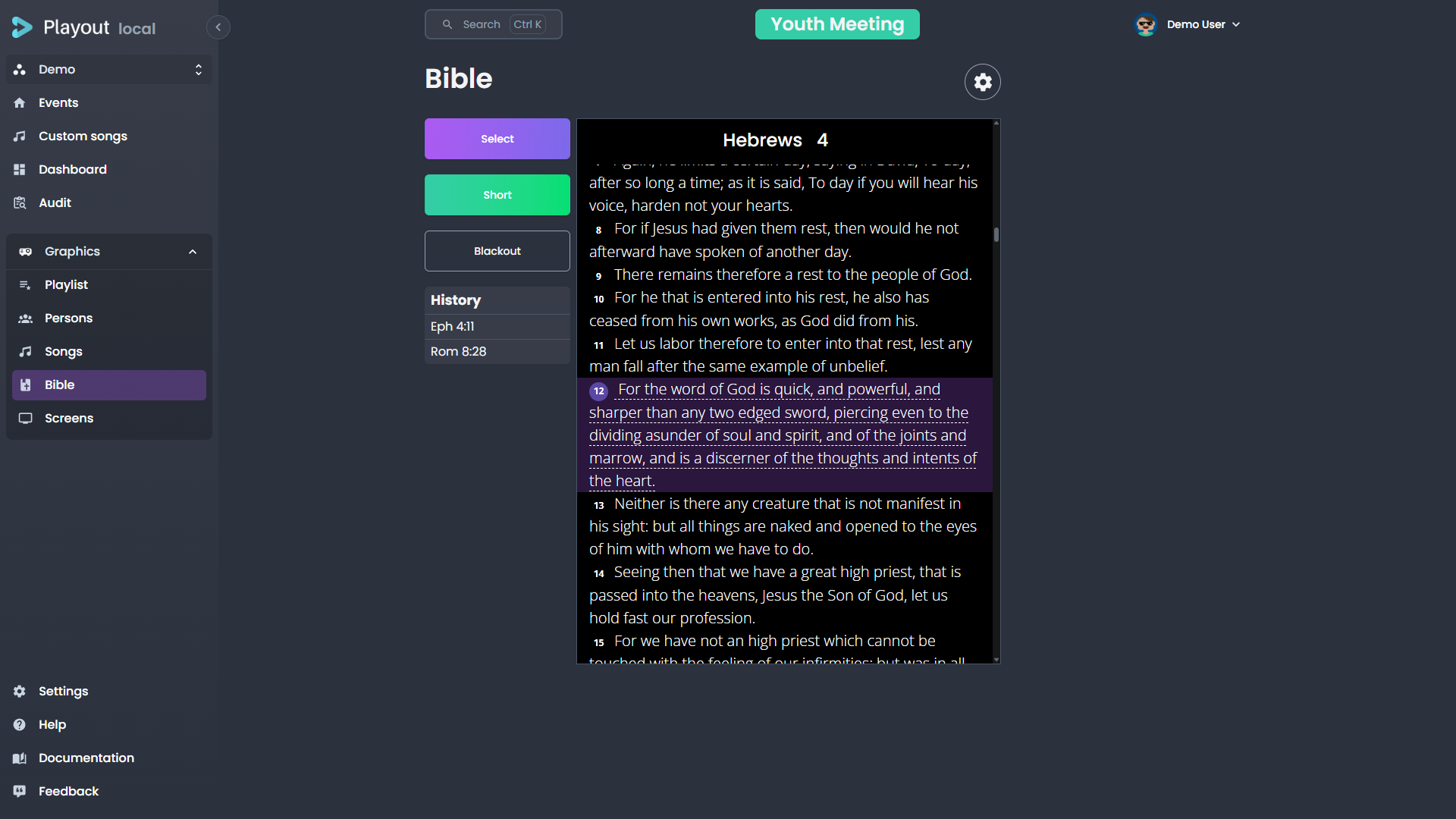
Selecting a Verse
- Choose a book from the dropdown (or search)
- Select the chapter
- Enter the verse number
Click the "Short" action to display the verse on screen.
Navigating Verses
Once a verse is displayed, a preview of the text appears. You can navigate directly to a different verse by clicking on its verse number in the preview.
Multiple Versions
If your tenant has multiple Bible versions configured (see Settings), you can switch between them using the settings gear.
Screens
The Screens tab is available to admins only. It controls the configuration of your overlay output screens.
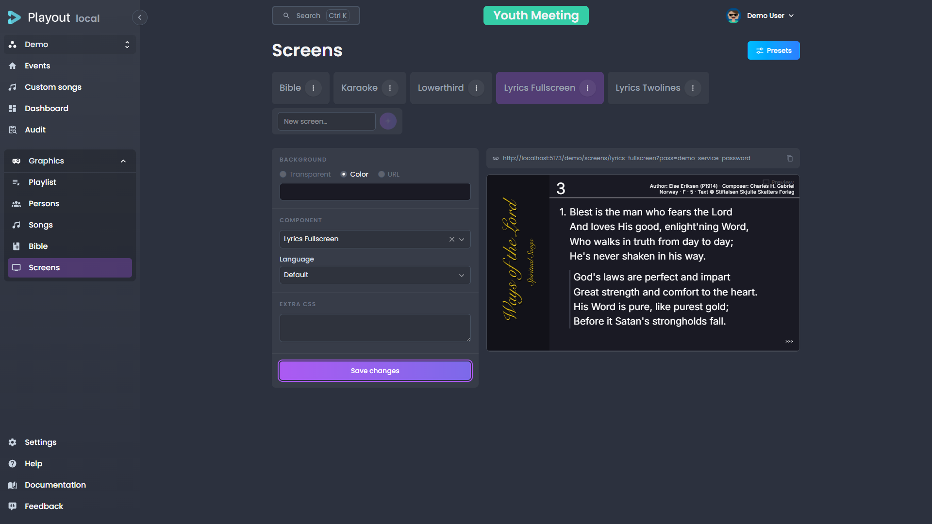
Screen Settings
Each screen can be configured with:
| Setting | Description |
|---|---|
| Color | The background color for overlays on this screen |
| Component | Which overlay component to display |
| Language | Language for text overlays |
| Bible version | Default Bible version for this screen |
Presets
Your screen layouts are saved and reused as part of an event preset. A preset bundles the screen configuration together with the event's other shared settings (colour, location, streaming rules, and more), so applying one sets up a whole event at once.
Presets are managed from the event dashboard, not this page. See Event Presets for how to save, apply, and override them.
TIP
When creating an event, you can select a preset to automatically configure the screens — and the rest of the shared settings — when the event starts.
Custom Overlays
INFO
The Custom Overlays feature requires the Components feature flag to be enabled in Settings.
Custom overlays are graphics you design once and reuse — a lower third, a caption, a sponsor bar — built from a simple HTML template with placeholders for the parts that change. They let you go beyond the built-in person, song, and Bible overlays.

The Editor at a Glance
The page is split into two parts:
- The overlay list (left) — every overlay in your tenant, with a search box and an Add field at the bottom. A green dot marks an overlay that is currently on screen. Hover an overlay to duplicate it.
- The editor (right) — opens when you select an overlay. It has three tabs:
| Tab | What it's for |
|---|---|
| Preview | A full-width, live preview of the overlay at 1920 × 1080, on a checkerboard backdrop so transparent areas read clearly. |
| Data | The values that fill your template's placeholders. |
| Template | The HTML template itself. |
A few things apply across all tabs:
- Auto-save — Edits save on their own as you work. A quiet Saving… / Saved indicator sits next to the tabs; there is no Save button.
- Rename — Edit the Overlay name field at the top.
- Show on screen — The live Show on screen / Hide from screen button is always visible, independent of the active tab. This is the only action that affects the broadcast.
- Delete — Removes the overlay, at the bottom of the editor.
Creating an Overlay
You have two starting points:
- New from template — Opens a gallery of ready-made overlays. Pick one to clone, then edit its text and colours. This is the easiest way to start.
- Start blank — Type a name in the Add field (or use Start blank from the empty state) to create an empty overlay. A new overlay opens straight to the Template tab so you can start writing.
Writing a Template
A template is plain HTML. Wherever you want a value that changes between uses, insert a placeholder with double curly braces:
html
<div class="lower-third">
  <h1>{{name}}</h1>
  <p>{{role}}</p>
</div>
Each placeholder automatically becomes a field on the Data tab — here, a name field and a role field.
To repeat a block (for example, a list of sponsors), wrap it in a section:
html
<ul>
  {{#sponsors}}
    <li>{{company}}</li>
  {{/sponsors}}
</ul>
This creates a repeating sponsors list on the Data tab, where each item has a company field. Add as many items as you need.
TIP
Placeholders and sections use Mustache syntax. You only need {{value}} for a single value and {{#list}}…{{/list}} for a repeating section — that covers almost every overlay.
Controlling Field Types
By default every placeholder becomes a plain text box on the Data tab. To get a better editor — a colour picker, a date picker, a dropdown — declare the field's type with a hint comment at the top of your template:
html
{{! @field accent: color }}
{{! @field starts: date }}
{{! @field size: select, small, medium, large }}
The hint format is {{! @field <name>: <type> }}. Supported types:
| Type | Editor shown on the Data tab |
|---|---|
text | Single-line text box (the default) |
textarea | Multi-line text box |
number | Number input |
email | Email input |
color | Colour picker |
date | Date picker |
select | Dropdown — list the options after the type, comma-separated (e.g. select, small, medium, large) |
boolean | On/off toggle |
image | Text box for an image URL |
To type a field inside a repeating section, use a dotted path — the section name, then the subfield:
html
{{! @field sponsors.logo: image }}
{{#sponsors}}
  <img :src="{{logo}}">
{{/sponsors}}
TIP
An unknown or misspelled type is simply ignored, and the field falls back to a plain text box — your overlay never breaks because of a hint.
Filling in Data and Going Live
Switch to the Data tab and fill in the values for each field. The Preview tab updates as you type, so you can see exactly what will appear. When the overlay is empty of placeholders, the Data tab shows a short note instead of a form.
When you're happy, click Show on screen to push the overlay to the broadcast. The button changes to Hide from screen while it's live, and the overlay's dot in the list turns green.
Animations
Open the Advanced section below the tabs to control how the overlay appears and disappears:
- Enter and Leave animations are set independently. Choose from presets such as fade, slide, and scale.
- The preview replays the animation whenever you show or hide the overlay, so you can check how it looks without going on air.
For full control, set either animation to Custom (CSS). A CSS editor appears where you can define your own keyframes and transition classes. Target these class names:
.custom-enter-active,.custom-enter-from— the entrance.custom-leave-active,.custom-leave-to— the exit
INFO
Each overlay also carries its own CSS, injected only while the overlay is on air. Use it for keyframes or any styling your template needs.
A Worked Example
A simple sponsor bar that cycles through a list:
html
{{! @field accent: color }}
{{! @field sponsors.logo: image }}
<div class="sponsor-bar" style="border-color: {{accent}}">
  <span class="label">With thanks to</span>
  {{#sponsors}}
    <img class="logo" src="{{logo}}" alt="{{company}}">
  {{/sponsors}}
</div>
On the Data tab you'd get a colour picker for accent and a repeating sponsors list, each item with an image-URL logo and a text company. Fill them in, watch the Preview, pick an enter/leave animation under Advanced, then Show on screen when you're ready.